
Table of Contents
- Definition
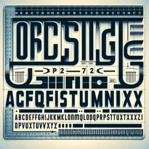
- Key Terms in Typeface Design
- History of Typeface Development
- Typeface Terms
- Styles & Categories
- Frequently Asked Questions
Definition
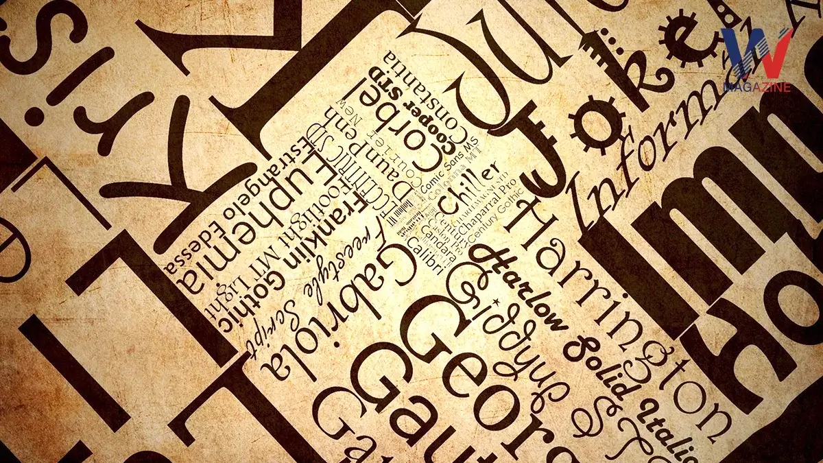
A typeface is essentially a set of designs for characters including letters, numbers and symbols. These designs maintain a consistent style that can be used for printing or displaying text on screens.
Important Key Facts
- Variations and Fonts: Within a typeface, you can find different variations like size, weight (how bold or light it is), slope (like italic), and width (such as condensed). Each specific style within a typeface is what we call a font.
- Purpose and Usage: Typefaces are used everywhere from books and websites to advertisements and signage. Designers choose specific typefaces to convey certain moods, messages or to make text easier to read.
- Design Process: The process of creating a typeface is known as type design. The people who specialize in this craft are called type designers. These designers often work for companies that create and sell typefaces, known as type foundries.
- Technical Details: Every typeface includes multiple glyphs, which are the individual shapes that represent each character in a set. Some glyphs, like the uppercase “A,” can be used in different languages that share similar characters.
- Specialized Typefaces: Certain typefaces are created for specific purposes beyond simple text display. For example, there are typefaces designed especially for maps, scientific publications or decorative purposes, each tailored to meet unique visual requirements.
If you are interested in earth and space science than we have a blog that has all the information you need to improve your understanding with Edgenuity Earth and Space Science Answers.
Key Terms in Typeface Design
Typeface Vs Font
- Typeface: This is the overall design of lettering which includes the look of letters, numbers and symbols without specification to size or style.
- Font: A font refers to a specific style and size within a typeface. For example, an 8-point Caslon Italic is one font and a 10-point Caslon Italic is another.
Font Families and Superfamilies
- Font Family: A collection of fonts that are stylistically similar but vary in weight (like bold or light), width (like condensed) or orientation (like italic). For instance, ‘Times’ is a font family.
- Superfamily: A larger grouping that includes multiple font families which are structurally different but have some design relationship. These can mix serif and sans serif styles, like Clearface Gothic paired with Clearface.
Technical Details
- Glyphs: Individual characters in a typeface, including letters, numbers, punctuation marks and symbols.
- Extended Font Families: These are comprehensive collections that offer a wide range of styles and weights under the same general design, emerging in the early 1900s with sets like ATF’s Cheltenham.
Special Fonts and Glyphs
- Supplemental Fonts: Additional fonts that are intended to complement a main typeface, often including alternative characters or decorative elements like swashes.
- Expert Set Fonts: These contain a standardized set of additional glyphs not found in the main fonts, such as small caps and old style figures, developed initially in the 1990s by Adobe.
Measurement and Sizing
- Point Size: The traditional measurement for the size of fonts, now most commonly defined as 1/72 of an inch. This measurement relates to the height of an invisible box called the em-square, which scales to equal the specified size of the font.
Platform-Specific Fonts
- Operating System Differences: Due to different character supports by Apple’s and Microsoft’s systems, fonts may include characters specific to one platform to ensure consistency across systems.
These simple explanations should help clarify the technical jargon related to typefaces and fonts, making it more accessible for those not deeply familiar with typography.
History of Typeface Development
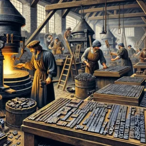
Starting in the 1450s, type foundries began casting fonts using lead alloys, a method that continued for centuries. During the 19th century, especially in the United States, large fonts were sometimes made from wood, known as “wood type.”
The 1890s saw a significant shift with the mechanization of typesetting. Machines like the Linotype, invented by Ottmar Mergenthaler, allowed fonts to be cast automatically as needed for lines of type. This method, known as continuous casting, remained popular and profitable until the 1970s.
During the mid-20th century, a new method called phototypesetting replaced older techniques. This involved using high-resolution images of glyphs on film strips. A high-intensity light would project each glyph onto photosensitive paper, allowing for optical scaling. This meant designers could create various sizes from a single font, although adjustments were needed for different sizes to accommodate things like ink spread during printing.
By the 1970s and 1980s, several typesetting technologies were in use, including the older letterpress and the new digital typesetters. These early digital systems were large and not very advanced, but they paved the way for modern digital typography. Over time, as technology advanced, digital fonts became the norm. These are computer files that contain scalable outlines of letterforms and can be used in various sizes and styles on computers and other digital displays. Some typefaces, like Verdana, are specifically designed for clear readability on screens.
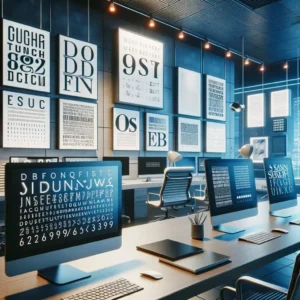
Typeface Terms
A typeface is a design of letters, numbers and symbols in a consistent style used for writing and printing. Typographers have specific terms to describe various aspects of these designs, though some terms may apply only to certain languages or scripts. For example, features called serifs are found primarily in European scripts.
A common source of comfort and entertainment for writers is looking through writing memes. We have got the top 10 writing memes for you!
Serifs and Sans Serifs
- Serif Fonts: These fonts include small lines or decorative elements at the ends of the strokes in letters. Serif fonts are often used in printed books and newspapers because they are considered easier to read in long texts.
- Sans Serif Fonts: Literally meaning “without serifs,” these fonts lack the extra lines on the ends of strokes. They are commonly used on websites and digital displays where clarity at smaller sizes is essential.
Font Categories
- Proportional Fonts: In these fonts, each character can have a different width. Proportional fonts are typically used in most modern text applications like word processors and websites because they look more natural and are easier to read.
- Monospaced Fonts: Every character in a monospaced font is the same width. This uniformity is crucial for tasks where alignment and character spacing must be consistent, like coding or creating ASCII art.
Font Metrics
This refers to measurements related to characters in a typeface, including:
- Baseline: The imaginary line on which most letters sit.
- Ascender and Descender: Parts of the letters that rise above or drop below the baseline.
- X-Height: The height of the lowercase letters, not including any part that might extend above (ascenders) or below (descenders) the main body of the letter.
Optical Sizing
Typefaces may be designed with variations for different sizes to ensure readability and aesthetic appeal across various text sizes. This design process is known as optical sizing. It adjusts the typeface details to be more legible at specific sizes, which is especially important for serif fonts.
Typesetting Numbers
Numbers in typefaces are designed in a few ways:
- Lining Figures: Numbers that align with the height of capital letters, commonly used in documents where uniformity is the key.
- Non-Lining Figures: These are numbers that blend in with the height and alignment of lowercase letters, often used in running text to maintain a consistent rhythm and style.
- Proportional Vs Tabular: Proportional numbers are spaced based on the width of the character, making text flow better. Tabular numbers, however, are all the same width, which is useful for lists and tables where alignment is important.
These elements and choices in typeface design significantly influence how text is perceived and read, affecting everything from legibility to aesthetic appeal in various contexts.
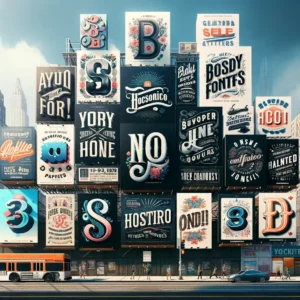
Styles & Categories
Typefaces come in a vast range of styles and categories, each designed to serve different visual and communicative purposes. Here’s an overview of the primary types of typefaces, which are often classified by their distinctive features, historical context or design intent:
1. Serif Typefaces
These typefaces are characterized by small lines or extensions (serifs) at the ends of larger strokes in the letters. Serif typefaces are often perceived as traditional and formal, making them a popular choice for printed books, newspapers and documents. Examples include:
- Old Style: Garamond, Bembo
- Transitional: Times New Roman, Baskerville
- Didone (Modern): Bodoni, Didot
- Slab Serif: Rockwell, Clarendon
2. Sans Serif Typefaces
Sans serif, meaning “without serifs,” these typefaces have clean, simple lines without the embellishments at the ends of strokes. They’re often used for their readability on digital screens and in more modern or minimalistic contexts. Examples include:
- Grotesque: Franklin Gothic, Akzidenz Grotesk
- Neo-grotesque: Helvetica, Univers
- Geometric: Futura, Avenir
- Humanist: Gill Sans, Frutiger
3. Script Typefaces
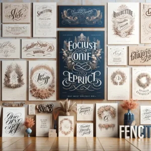
These typefaces mimic handwriting, with letters often connecting in fluid, cursive styles. Script typefaces can range from casual to highly formal designs and are typically used for invitations, branding and display purposes. Examples include:
- Formal Scripts: Snell Roundhand, Bickham Script
- Casual Scripts: Brush Script, Freestyle Script
4. Display/Decorative Typefaces
Designed specifically for use at large sizes for headings or decorative purposes, display typefaces include a diverse range of styles. They are not intended for body text as they can be difficult to read in long passages. Examples vary widely, from themed typefaces to highly stylized modern creations.
5. Monospaced Typefaces

Every character in monospaced typefaces takes up the same amount of horizontal space. These are commonly used in coding environments, typewriters and information where alignment of text is critical. Examples include:
- Courier, Consolas, Monaco
6. Blackletter Typefaces
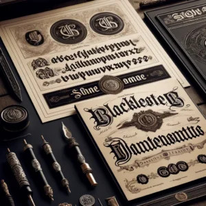
Blackletter typefaces, also known as Gothic script, these typefaces are heavily stylized with ornate details and are reminiscent of medieval manuscripts. They are often used in formal and ceremonial contexts, such as diplomas or in the branding of newspapers. Examples include:
- Fraktur, Textualis
7. CJK Typefaces
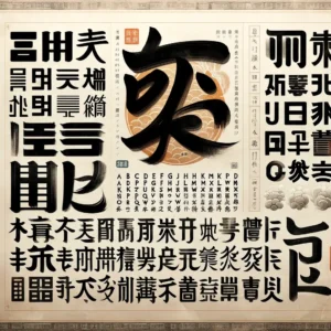
Referring to Chinese, Japanese and Korean scripts, CJK typefaces are designed to accommodate the vast number of characters and the calligraphic and brush stroke traditions of these languages. Examples include:
- Mincho: Serif-like features, commonly used in print
- Gothic: Sans-serif-like, preferred for on-screen use
These primary categories help navigate the extensive world of typography, with each type serving specific design functions and aesthetic preferences.
Frequently Asked Questions
What is Old English Typeface?
The “Old English” typeface, also known as Blackletter, refers to a script style that originated in the early medieval period in Western Europe. It is characterized by its dense, intricate appearance, which includes sharp, broken, or angular lines and elaborate strokes. This style of typeface is often associated with historical documents, medieval manuscripts, and ornamental typography.
What is Facebook Typeface?
Facebook primarily uses a typeface called “Segoe UI” for its user interface on Windows platforms and “San Francisco” on Apple devices. For Android, Facebook typically uses “Roboto”. These typefaces are known for their clean and modern look, which enhances readability and provides a sleek, contemporary aesthetic suitable for digital screens.
Background on the Typefaces
- Segoe UI: This is a sans-serif typeface developed by Microsoft and is part of the Segoe family. It’s designed to offer clear readability with a neutral, yet friendly appearance.
- San Francisco: Developed by Apple Inc., San Francisco is the system font for macOS and iOS. It is designed specifically for maximum legibility on computer and mobile screens.
- Roboto: Google’s signature typeface for the Android operating system, Roboto features friendly and open curves. Despite its mechanical structure, Roboto’s letters are geometrically pleasing, making it very readable on digital screens.
What is Kis Typeface?
The Kis typeface, also known as Janson Text or Kis Antiqua. It is a serif typeface originally designed by the Hungarian-born punchcutter and printer Miklós (Nicholas) Kis in the late 17th century. This typeface is noted for its readability and classic design, making it a popular choice for book printing and other forms of lengthy text documents.
Characteristics of the Kis Typeface
- Serif Style: It features sharp, bracketed serifs.
- Contrast: There is moderate contrast between thick and thin strokes, typical of Baroque-era typefaces.
- Legibility: Its clear, open forms make it highly legible, which is ideal for body text in printed books and publications.
What is Reptile Typeface?
The term “reptile typeface” isn’t widely recognized as a standard category or specific style within the typographic community. It’s possible that “reptile typeface” could refer to a font designed to evoke characteristics associated with reptiles, such as scales or a sinuous shape, which might be used in thematic designs related to nature, zoology or fantasy.
What is Anime Typeface?
The term “anime typeface” generally refers to fonts that are used or inspired by the style seen in anime, which is a style of animation originating from Japan. These typefaces often capture the dynamic, expressive qualities associated with anime titles, character names, and other on-screen text, blending both traditional Japanese and modern influences.
Characteristics of Anime Typefaces
- Stylistic Variety: Anime typefaces can vary greatly but often include bold, rounded or angular shapes that convey emotion and action, mimicking the energy and drama of anime storytelling.
- Cultural Blend: Many anime typefaces blend traditional Japanese calligraphic and brush stroke styles with Western typographic styles, reflecting the cross-cultural appeal of anime.
- Decorative Elements: These fonts might include unusual kerning, variable baseline heights and decorative elements like stars, dots and unconventional shapes to enhance visual impact.
Uses of Anime Typefaces
- Titles and Logos: Anime typefaces are prominently used in the titles and logos of anime shows and movies, designed to catch the eye and convey the theme or mood of the anime.
- Subtitles and Credits: Fonts that are easy to read yet stylistically in tune with anime aesthetics are often used for subtitles, credits or other on-screen text.
- Marketing and Merchandise: These typefaces are also used in marketing materials, merchandise like T-shirts and posters and in the general branding related to anime series or films.
Examples
Some fonts that are popular in the anime community include:
- Anime Ace: Designed specifically for use in comic books and similar media, which makes it a common choice for English-language manga and anime translations.
- Shojumaru: Inspired by the titling of classic samurai films, this font carries a cinematic feel that aligns well with historical or action-oriented anime.
Anime typefaces are not standardized and can be custom designed for specific series or titles, which adds to the diversity and creativity seen in anime graphics and typography.
What is Banana Typeface?
Banana typeface refers to a playful, whimsical font that mimics the curved shape of bananas or includes banana-like elements in its design, possibly used in contexts related to fruit, children’s products or casual branding.
Serif Vs Sans Serif Typeface?
| Feature | Serif Typefaces | Sans Serif Typefaces |
| Visual Style | Decorative strokes at the ends of letter strokes | Clean lines without decorative strokes |
| Feel & Tone | Traditional, formal, and professional | Modern, approachable, and straightforward |
| Readability | Better for printed text, enhances ease of reading in long passages | Better on screens, offers clear legibility at smaller sizes or lower resolutions |
| Common Uses | Books, newspapers, official documents | Websites, digital displays, informal content |
| Example Fonts | Times New Roman, Garamond, Baskerville | Helvetica, Arial, Futura |
This table provides a concise comparison, helping you clear the query of serif vs sans serif typeface.